How to adopt iOS 11 user interface changes in your app
Large navigation titles, new edge swipe controls, safe area insets, and more.

iOS 11 introduces a variety of major changes to the way apps look and work, and how they interact with the user. In fact, it’s easily the biggest set of design changes since iOS 7, and in some places actually reverses choices made in iOS 7.
So, if you're keen for your app to look and feel part of the new iOS design language you’ll need to start making a few changes now: large navigation titles, better use of safe edges, improved table view swipe actions, and more.
Note: this article is an excerpt from my book Practical iOS 11.
BUILD THE ULTIMATE PORTFOLIO APP Most Swift tutorials help you solve one specific problem, but in my Ultimate Portfolio App series I show you how to get all the best practices into a single app: architecture, testing, performance, accessibility, localization, project organization, and so much more, all while building a SwiftUI app that works on iOS, macOS and watchOS.
Sponsor Hacking with Swift and reach the world's largest Swift community!
Large navigation titles
First and most significantly are the new large titles in navigation bars. They were first introduced with Apple Music, but now appear in Settings, Notes, Mail, App Store, and more. This design brings with it a few interesting features:
- The title shrinks when you scroll, eventually reverting to iOS 10 style where it sits neatly inside the bar itself.
- If you pull down to get scroll view bouncing, you’ll see the new large title get a tiny bit larger.
- You can control which view controllers should have large titles and which should have small.
- You can attach search controllers to the bar to have them participate in this shrinking effect. If you prefer you can have your search bar remain static even during scrolling.
- If you use a
UIRefreshControlit will get hoisted – it will be pulled out of its existing view hierarchy and moved up above the navigation item title.
This new navigation bar size forms a large part of the new bolder user interface approach that sits across all of iOS 11 – font weight has increased in places such as tab bar items, and icons are now heading back to being filled in just like they were before iOS 7.
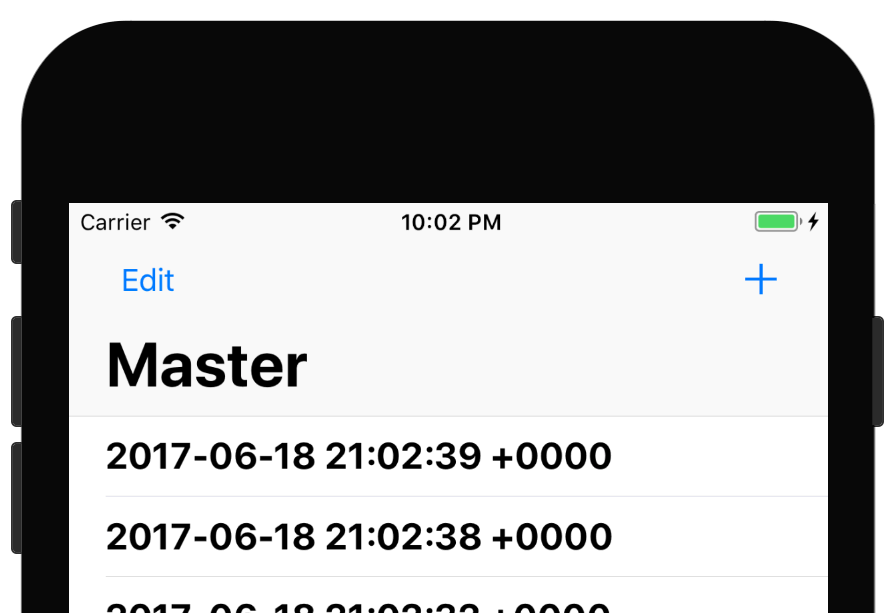
To start trying out these new features, create a new iOS project using the Master-Detail App template, naming it Project8-iOSDesign. Go ahead and run the app in the iPhone simulator, and you’ll see the following:
- “Master” in the navigation bar by default.
- A + sign that lets you add rows.
- When you tap a row, the detail view controller slides in.
- This has the title “Detail” in the navigation bar.
To get started converting this project for iOS 11 we just need to add one line of code inside MasterViewController.swift’s viewDidLoad() method:
navigationController?.navigationBar.prefersLargeTitles = trueThat will immediately enable large-title mode: both Master and Detail will appear big at the top, with the navigation bar sizing to take that into account.
If you click a detail item now, you’ll see a smooth animation that moves the “Master” title up into the back button, and also a new large title for “Detail”. Apple recommends you use these new large titles sparingly: they are great for top-level navigation, particularly when used with tabs, and particularly when several tabs have similar user interface layouts. In the case of Mail, Apple uses large titles for the top two levels (“Mailboxes” and “Inbox”), but only because it makes sense there.
In this app, it makes sense to use a large title for “Master”, but probably not for “Detail”. We get it for both because once you enable large title support, new view controllers you push will automatically inherit the previous title mode – if the first title is large, the second and subsequents will be too.
You can customize this behavior by adjusting the largeTitleDisplayMode property of each view controller’s navigation item. It’s set to .automatic by default, which gives us the inheriting behavior, but there’s also .always and .never, which let you selectively override which view controllers have large titles.
You can tell view controllers which style to use in code or using IB; both are pretty straightforward. To do it in IB:
- Open Main.storyboard.
- Open “Detail Scene”
- Open “Detail”
- Select “Detail” – it should have a left-facing blue arrow next to it.
- Go to the attributes inspector and change Large Title to Never.
To do it in code, open DetailViewController.swift and add this custom initializer:
required init?(coder aDecoder: NSCoder) {
    super.init(coder: aDecoder)
    navigationItem.largeTitleDisplayMode = .never
}
You need to do this as soon as the controlled is initialized – if you wait until viewDidLoad() the animation goes awry.
With that tiny change in place you’ll find that the Master controller has a large title but the Detail controller doesn’t – and also that the navigation bar automatically resizes as each view controller is activated.
Next up, let’s take a look at how these new navigation bars help integrate search. Previously you needed to create your UISearchController then add it to your view hierarchy manually, and often people set it to their table header view. With iOS 11 you can move it up into the navigation bar, and even have it fixed in place if you want.
To get started, you need to assign an instance of UISearchController to your navigation item, like this:
navigationItem.searchController = UISearchController(searchResultsController: nil)Obviously you’ll also need to conform to the UISearchResultsUpdating protocol so you can respond when searches happen.
If you run the app now you’ll see it looks identical: the large title Master then some table rows below. However, if you try dragging the table downwards you should see the new search box – it gets hidden by default. Try adding 50 or so rows, and you’ll see the search bar show and hide itself automatically – Apple works hard to keep your app’s content at the forefront.
If you’d rather have the search bar visible all the time, add this line:
navigationItem.hidesSearchBarWhenScrolling = falseAt the very least that’s helpful while testing!
Rethinking the edges
Screen edges have been problematic in iOS for some years: when the notification center was introduced swiping from the top edge conflicted with some apps, when the control center was introduced swiping from the bottom edge conflicted with other apps, and of course iOS 7 introduced translucent bars that even today cause great anguish for developers.
Part of the problem with these changes is that they accumulated over time, rather than being introduced in one lump. When the notification center was introduced, Apple added a little pull-down tab to apps that hid the status bar – if you pull down to active the notification center, you instead got a small arrow you had to pull down further, reducing the likelihood of conflicts. When the control center was introduced, the same trick was repeated – even though swiping up from the bottom really had nothing to do with the status bar.
In iOS 11, Apple is finally wiping the slate clean and taking a new approach that resolves top and bottom swipes, and even some of the problems caused with translucent bars.
Let’s start with a simple improvement: a new method on UIViewController called preferredScreenEdgesDeferringSystemGestures(), which lets you specify which screen edges should delay system gestures like the notification center and control center.
In our Master-Detail App template, Apple provides us with two view controllers, both embedded inside navigation controllers, both of which are inside a split view controller. iOS always asks the top-most view controller how it wants to handle things, so we need to create a custom UISplitViewController subclass in order to override system gesture behavior.
So, go to the File menu and choose New > File, then choose Cocoa Touch Class. Make it a subclass of “UISplitViewController” named “CustomSplitViewController”, then open it for editing.
First, we need to tell this view controller to hide its status bar. This is done using the prefersStatusBarHidden property that was introduced in iOS 7, so add this code now:
override var prefersStatusBarHidden: Bool {
    return true
}
Second, we need to tell the whole app to hide the status bar during launch, otherwise the status bar appears briefly when the app first starts. To do that, click the top “Project8-iOSDesign” from the project navigator (the one with a blue icon next to it), then check the “Hide status bar” checkbox in the General tab.
Finally, we can go back to CustomSplitViewController.swift and tell it how we want to defer system gestures. Previously, all apps would defer no gestures, so swiping down or app would show the notification center or the control center immediately, whereas apps that hid the status bar would get an intermediate state.
By overriding preferredScreenEdgesDeferringSystemGestures() we can now be far more precise. To try it out, add this code to tell iOS we want to defer swipes coming from the top but nowhere else:
override func preferredScreenEdgesDeferringSystemGestures() -> UIRectEdge {
    return .top
}
Two smaller changes are also helping the way we deal with screen edges. First, topLayoutGuide and bottomLayoutGuide have been replaced with new safe area insets: the area within which you may show content without it being obscured by system bars.
Before I show you some code, there are a few things to note:
-
The
topLayoutGuideandbottomLayoutGuideproperties ofUIViewControllerhave been deprecated; if you target iOS 11 and above you’ll get warnings. -
Despite that, you can’t use
safeAreaLayoutGuidefrom inside – or at least not yet. Instead, you’ll see “Top Layout Guide” and “Bottom Layout Guide”, and choosing either of them generates warnings. -
If you create layouts in code, you should look for
safeAreaLayoutGuideinsideUIViewor its subclasses, not inUIViewController. -
These safe areas apply to the left and right edges, not just top and bottom. To me this suggests a new iPhone will ship with significantly smaller bezels, so the safe area is there to avoid accidental touches.
To demonstrate the new safe area layout guide in action, let’s fix a small annoyance in the detail view control. Xcode’s default template has it automatically center itself vertically inside the superview, but it doesn’t take into account the existence of its navigation bar. This means it’s centered inside the view as a whole (if your device is in landscape, it’s aligned directly with the home button), but not inside its content area.
We’re going to change that using safeAreaLayoutGuide, which means removing the label’s existing constraints and replacing them in code.
First, open Main.storyboard and select the detail label – it should say “Detail view content goes here”. Now go to the Editor menu and choose Resolve Auto Layout Issues > Clear Constraints. You’ll see Clear Constraints listed twice, but both options do the same thing here.
Second, open DetailViewController.swift and and add this code inside viewDidLoad():
detailDescriptionLabel.translatesAutoresizingMaskIntoConstraints = false
detailDescriptionLabel.centerXAnchor.constraint(equalTo: view.safeAreaLayoutGuide.centerXAnchor).isActive = true
detailDescriptionLabel.centerYAnchor.constraint(equalTo: view.safeAreaLayoutGuide.centerYAnchor).isActive = true
That tells the label to center itself inside the safe area of its superview, which will take into account the existence of the navigation bar. And if in the future you add a tab bar into the mix, it will take that into account too.
The last thing I want to mention briefly is the way contentInsets is now automatically adjusted by the system. Ever since iOS 7 introduced its frosted glass navigation and tab bars, it was standard behavior to place scroll views, table views and collection views behind the bars and allow their content insets to get automatically pushed down by the system.
While this system worked (often with some pain along the way!) it nearly always caused issues when you wanted to add your own content insets because they conflict with the system’s own adjustment. With iOS 11 Apple has split the two insets: you can go ahead and manipulate contentInsets as much as you want, and iOS will combine it with its own insets separately.
The two new properties you need to learn are called contentInsetAdjustmentBehavior and adjustedContentInset. The former lets you control whether a scrolling view should be pushed inside bars, and the latter lets you read the total content inset adjustment – this is a combination of iOS’s own adjustment and however much content inset you applied.
The default value of contentInsetAdjustmentBehavior is .automatic, which mimics the behavior right now. You’re likely to want to try using .always and .never as well, letting you control how the inset happens.
The computed value of adjustedContentInset is available only when views have been fully laid out, so we can try reading it inside viewDidLayoutSubviews(). Add this method to MasterViewController.swift now:
override func viewDidLayoutSubviews() {
    super.viewDidLayoutSubviews()

    tableView.contentInset = UIEdgeInsets(top: 40, left: 0, bottom: 0, right: 0)
    print(tableView.adjustedContentInset)
}
That requests a 40-point inset at the top, but when adjustedContentInset is printed out you’ll see the top inset is actually 160 points.
Improved table views
iOS 11 introduces two new changes that are most welcome: automatic automatic sizing for cell rows, and improved support for swipe actions.
Now, you probably read “automatic automatic sizing for cell rows” and imagined I had made a typo by repeating the words, but it’s pretty much exactly that: iOS has let us use Auto Layout to determine row sizes for some time, but you always needed to explicitly request it. As of iOS 11, automatic cell sizing is enabled automatically – you get it with no further work, although you can still specify your own custom sizes if you want.
To try this out for yourself, open MasterViewController.swift and change its cellForRowAt method to this:
override func tableView(_ tableView: UITableView, cellForRowAt indexPath: IndexPath) -> UITableViewCell {
    let cell = tableView.dequeueReusableCell(withIdentifier: "Cell", for: indexPath)
    cell.textLabel?.text = "This is some very long text that should definitely wrap across multiple lines"
    return cell
}
Because that forces a long text string into the label, and also modifies its numberOfLines property to 0 (“overflow to as many as if needed”), that will make UIKit increase the row size to fit the label in full – easy!
The other big table view improvement is the ability to create both leading and trailing swipe actions for your cells, letting users swipe either left or right to activate functionality. In iOS 11 you can also attach images to these actions, and even tell them to trigger automatically if the user swipes far enough.
To make this work you need to learn two new classes: UIContextualAction is responsible for one swipe action, and UISwipeActionsConfiguration is responsible for a group of swipe actions. When you create the contextual action you need to pass it the following:
- A style value. If you use
.destructiveit will automatically delete the cell when triggered, so make sure you update your data source. - A title to show to the user. You can replace this with an image if you prefer.
- Code to run when it’s executed. This should be a closure that accepts parameters for the contextual action, the view that triggered it, and a completion handler you can call when your work has finished. If your action completed successfully you should call the completion handler with “true”, otherwise “false”.
Let’s try it now – add this method to MasterViewController.swift:
override func tableView(_ tableView: UITableView, leadingSwipeActionsConfigurationForRowAt indexPath: IndexPath) -> UISwipeActionsConfiguration? {
    let read = UIContextualAction(style: .normal, title: "Mark as read") { action, view, completionHandler in
        print("Marking as read!")
        completionHandler(true)
    }

    return UISwipeActionsConfiguration(actions: [read])
}
There are two further properties you might want to investigate: backgroundColor for the contextual action lets you color the buttons, which is helpful if you want to mark something as dangerous without having it automatically deleted, and performsFirstActionWithFullSwipe, which lets the first contextual action be triggered when the user swipes all the way across the screen – helpful for quick responses to things.
To try them out, add this second method to create a trailing swipe action:
override func tableView(_ tableView: UITableView, trailingSwipeActionsConfigurationForRowAt indexPath: IndexPath) -> UISwipeActionsConfiguration? {
    let delete = UIContextualAction(style: .normal, title: "Delete") { action, view, completionHandler in
        print("Deleting!")
        completionHandler(true)
    }

    delete.backgroundColor = UIColor.red

    let config = UISwipeActionsConfiguration(actions: [delete])
    config.performsFirstActionWithFullSwipe = false
    return config
}
With both leading and trailing actions, you can swipe either left or right to activate them.
TAKE YOUR SKILLS TO THE NEXT LEVEL If you like Hacking with Swift, you'll love Hacking with Swift+ – it's my premium service where you can learn advanced Swift and SwiftUI, functional programming, algorithms, and more. Plus it comes with stacks of benefits, including monthly live streams, downloadable projects, a 20% discount on all books, and free gifts!
Sponsor Hacking with Swift and reach the world's largest Swift community!


