|

|
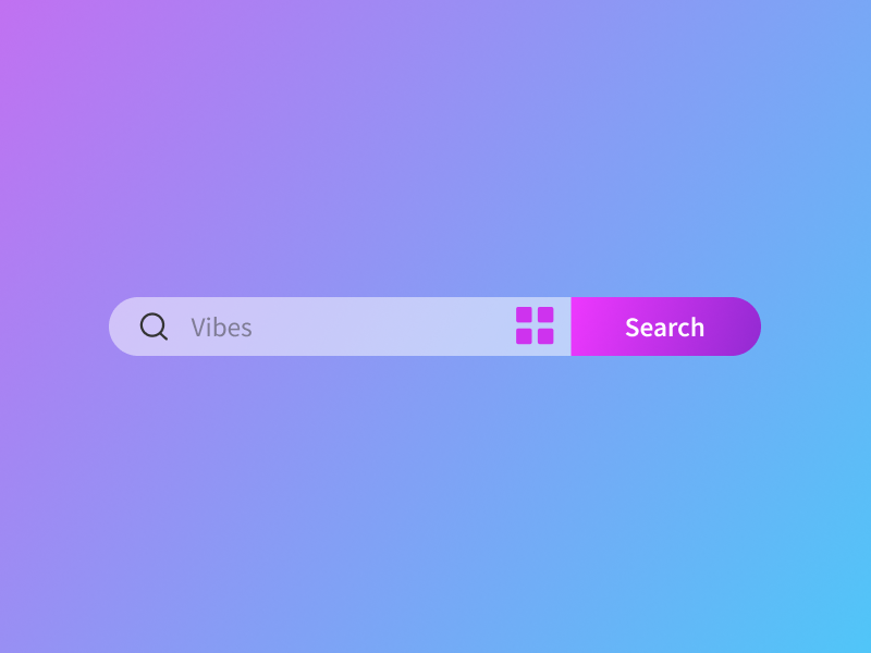
Identical approach can do the job
struct CapsuleTextFieldWithButton: View {
    @Binding var text: String
    var action: () -> Void

    var body: some View {
        ZStack {
            Color.blue.opacity(0.5)
                .ignoresSafeArea()

            HStack {
                Image(systemName: "magnifyingglass")

                TextField("Vibes", text: $text)

                Image(systemName: "square.grid.2x2.fill")
                    .imageScale(.large)
                    .foregroundStyle(.purple)

                Rectangle()
                    .frame(width: 100, height: 40)
                    .foregroundStyle(.purple.gradient)
                    .clipShape(UnevenRoundedRectangle(topLeadingRadius: 0, bottomLeadingRadius: 0, bottomTrailingRadius: 20, topTrailingRadius: 20, style: .continuous))
                    .overlay {
                        Button {
                            action()
                        } label: {
                            Text("Search")
                                .foregroundStyle(.white)
                                .font(.callout)
                        }
                    }
            }
            .padding(.leading)
            .background {
                Capsule()
                    .foregroundStyle(.thinMaterial)
            }
        }
    }
}

#Preview {
    CapsuleTextFieldWithButton(text: .constant("")) {
        print("Button Pressed")
    }
}

|
|

|
I was playing with .clipShape come up with this
HStack(spacing: 0) {
    TextField("\(Image(systemName: "magnifyingglass")) Vibes", text: $text)
        .padding()
        .background {
            UnevenRoundedRectangle(cornerRadii: RectangleCornerRadii(topLeading: 30, bottomLeading: 30))
                .strokeBorder(.quaternary, lineWidth: 2)
                .clipShape(.rect(cornerRadii: RectangleCornerRadii(topLeading: 30, bottomLeading: 30)))
        }

    Button("Search") { }
        .foregroundStyle(.white)
        .padding(17)
        .background(.blue)
        .clipShape(.rect(cornerRadii: RectangleCornerRadii(bottomTrailing: 30, topTrailing: 30)))
}
.padding()
|
|

|
Thanks for the effort guys, but it seems that UnevenRoundedRectangle is a custom shape, any info on this ?
|
|
|
|
|
|
I have playing around a bit more to make it more reusable
struct TextFieldButton: View {
    @Binding var text: String
    var action: () -> Void

    var body: some View {
        HStack(spacing: 0) {
            TextField("\(Image(systemName: "magnifyingglass")) Vibes", text: $text)
                .padding()
                .background {
                    UnevenRoundedRectangle(cornerRadii: .init(topLeading: 30, bottomLeading: 30))
                        .strokeBorder(.quaternary, lineWidth: 2)
                        .clipShape(.rect(cornerRadii: .init(topLeading: 30, bottomLeading: 30)))
                }

            Button("Search", action: action)
                .foregroundStyle(.white)
                .padding(17)
                .background(.blue)
                .clipShape(.rect(cornerRadii: .init(bottomTrailing: 30, topTrailing: 30)))
        }
        .padding()
    }
}
And now you can use it
struct ContentView: View {
    @State private var text = ""

    var body: some View {
        TextFieldButton(text: $text) {
            print("\(text)")
        }
    }
}
PS while the overlay of Button in an answer I would concerned the user typing text would go under the button (I have not tested it).
|
|
|
I know it's been a while but I had to learn SwiftUI and so I am a lot better able to manipulate things now.
I am on iOS 15.2 here, so no UnevenRoundedRectangle for me. I tried to make one by layering shapes on the Z-axis:
struct CustomText2: View {
    @State var text: String
    @Binding var isEditable: Bool
    var onDelete: (() -> Void)?
    @State var text2: String

    var body: some View {
        HStack {
            ZStack {
                Text(text2)
                    .frame(height: 50)
                    .frame(maxWidth: .infinity)
                    .background(.red)
                    .cornerRadius(15)

                ZStack {
                    CustomRoundButton(title: "X", action: {}, isActive: true)
                    Spacer()
                    CustomRoundButton(title: "X", action: {}, isActive: true)
                        .rotationEffect(.degrees(180))
                }
            }
        }
    }
}

struct CustomRoundButton: View {
    var title: String
    var action: () -> Void
    var isActive: Bool

    var body: some View {
        Button(action: action) {
            ZStack {
                HStack(spacing: 13) {
                    Spacer()
            RoundedRectangle(cornerRadius: 15, style: .circular)
                .fill(.blue)
                .frame(width: 75, height: 50)
                .clipShape(RoundedRectangle(cornerRadius: 15))
                .frame(width: 51, height: 50)
                .offset(x: 12)
                .background(.blue)

            Text(title)
            //Image(systemName: "trash")
                .foregroundColor(.white)
                .offset(x: -30)
                }
            }
        }
    }
}
The following will achieve something like what I need, but the effect is spoilt on a press event, as all the layers are visible when the button turns semi-transparent to signify that it has been pressed:

|
|
|
The following code will allow for the buttons to be independently pressed:
struct CustomText2: View {
    @State var text: String
    @Binding var isEditable: Bool
    @State var text2: String

    var body: some View {
        HStack {
            ZStack {
                Text(text)
                    .frame(height: 50)
                    .frame(maxWidth: .infinity)
                    .background(Color.red)
                    .cornerRadius(15)

                HStack {
                    CustomRoundButton(title: "pencil", action: edit, isActive: true, spacing: 17)
                    Spacer()
                    CustomRoundButton(title: "trash", action: delete, isActive: true, spacing: 15)
                        .rotationEffect(.degrees(180))
                }
            }
        }
    }

    func edit() {
        print("EDIT")
    }

    func delete() {
        print("DELETE")
    }
}

private struct CustomRoundButton: View {
    var title: String
    var action: () -> Void
    var isActive: Bool
    var spacing: CGFloat

    var body: some View {
        Button(action: action) {
            ZStack {
                HStack {
                    RoundedRectangle(cornerRadius: 15)
                        .fill(.blue)
                        .frame(width: 50, height: 50)

                    Rectangle()
                        .fill(.blue)
                        .frame(width: 25, height: 50)
                        .offset(x: -25)
                }

                    Image(systemName: title)
                        .foregroundColor(.white)
                        .padding(.leading, spacing)     // WORKAROUND : SPACING VALUES DIFFER PER SYMBOL
                        .rotationEffect(.degrees(180))
            }
        }
    }
}
|
|
|
Hi! Wouldn't it make your code do almost the same, not sure what is the function of your buttons... But less code and visibly result is the same, but no weird blinking...
struct CustomTextWithButtonsOnSides: View {

    @Binding var text: String
    var onButtonOnePressed: (() -> Void)? = nil
    var onButtonTwoPressed: (() -> Void)? = nil

    var body: some View {
        HStack(spacing: 0) {
            Button(action: {
                onButtonOnePressed?()
            }, label: {
                Text("Button 1")
                    .foregroundStyle(.white)
            })
            .padding()
            .background(Color.blue)

            Text(text)
                .padding(.vertical)
                .frame(maxWidth: .infinity, alignment: .center)
                .background(Color.red)

            Button(action: {
                onButtonTwoPressed?()
            }, label: {
                Text("Button 2")
                    .foregroundStyle(.white)
            })
            .padding()
            .background(Color.blue)
        }
        .clipShape(RoundedRectangle(cornerRadius: 10))
    }
}
|