Making your app accessible
In the full tutorial…
- A brief intro to VoiceOver
- Grouping our data
- Adding extra labels
Subscribe to Hacking with Swift+ today
Hacking with Swift+ delivers high-quality tutorials for subscribers, with each tutorial coming as a 4K Ultra HD video and in text form so you can read or watch – whatever works best for you.
So, you can get this full video and article as well as all other subscriber-only tutorials and all future tutorials – all by subscribing to Hacking with Swift+ today.
Membership includes…
✅
All HWS+ tutorials as both text and 4K video
✅
Downloadable projects and learning challenges
✅
Our massive Ultimate Portfolio App series
✅
Access to my monthly app building livestreams
✅
Free gifts for every year of your subscription
✅
An ad-free experience everywhere on the site
✅
Video solutions for the 100 Days of SwiftUI
✅
A 20% discount on all my books year-round
✅
Access to an exclusive forum for subscribers
✅
Videos from Hacking with Swift Live
More from Hacking with Swift+
31:55
DATA STRUCTURES
FREE: Trees
Trees are an extraordinarily simple, extraordinarily useful data type, and in this article we’ll make a complete tree data type using Swift in just a few minutes. But rather than just stop there, we’re going to do something quite beautiful that I hope will blow your mind while teaching you something useful.
32:08
CUSTOM SWIFTUI COMPONENTS
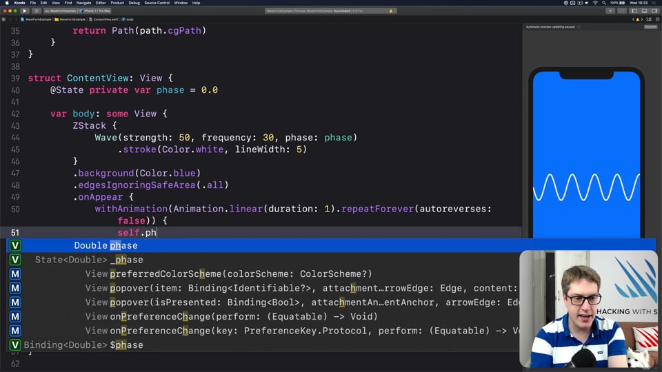
FREE: Creating a WaveView to draw smooth waveforms
In this article I’m going to walk you through building a WaveView with SwiftUI, allowing us to create beautiful waveform-like effects to bring your user interface to life.
42:32
FUNCTIONAL PROGRAMMING
FREE: Transforming data with map()
In this article we’re going to look at the map() function, which transforms one thing into another thing. Along the way we’ll also be exploring some core concepts of functional programming, so if you read no other articles in this course at least read this one!
14:20
INTERMEDIATE SWIFTUI
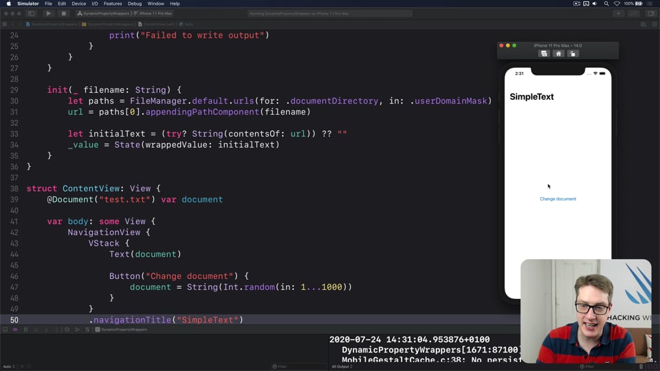
FREE: Creating a custom property wrapper using DynamicProperty
It’s not hard to make a basic property wrapper, but if you want one that automatically updates the body property like @State you need to do some extra work. In this article I’ll show you exactly how it’s done, as we build a property wrapper capable of reading and writing documents from our app’s container.
19:50
SWIFTUI SPECIAL EFFECTS
FREE: Shadows and glows
SwiftUI gives us a modifier to make simple shadows, but if you want something more advanced such as inner shadows or glows, you need to do extra work. In this article I’ll show you how to get both those effects and more in a customizable, flexible way.
14:26
NETWORKING
FREE: User-friendly network access
Anyone can write Swift code to fetch network data, but much harder is knowing how to write code to do it respectfully. In this article we’ll look at building a considerate network stack, taking into account the user’s connection, preferences, and more.
20:01
INTERMEDIATE SWIFT
FREE: Understanding generics – part 1
Generics are one of the most powerful features of Swift, allowing us to write code once and reuse it in many ways. In this article we’ll explore how they work, why adding constraints actually helps us write more code, and how generics help solve one of the biggest problems in Swift.

3:54
INTERVIEW QUESTIONS
FREE: Interview questions: Introduction
Getting ready for a job interview is tough work, so I’ve prepared a whole bunch of common questions and answers to help give you a jump start. But before you get into them, let me explain the plan in more detail…
6:52
FUNCTIONAL PROGRAMMING
FREE: Functional programming in Swift: Introduction
Before you dive in to the first article in this course, I want to give you a brief overview of our goals, how the content is structured, as well as a rough idea of what you can expect to find.
36:18
HIGH-PERFORMANCE APPS
FREE: Using memoization to speed up slow functions
In this article you’ll learn how memoization can dramatically boost the performance of slow functions, and how easy Swift makes it thanks to its generics and closures.
27:33
INTERMEDIATE SWIFT
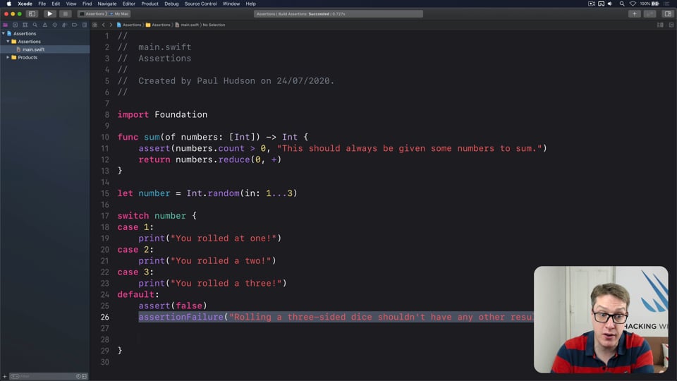
FREE: Understanding assertions
Assertions allow us to have Swift silently check the state of our program at runtime, but if you want to get them right you need to understand some intricacies. In this article I’ll walk you through the five ways we can make assertions in Swift, and provide clear advice on which to use and when.
24:11
ADVANCED SWIFT
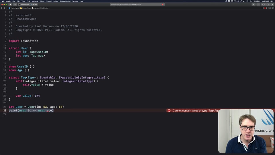
FREE: How to use phantom types in Swift
Phantom types are a powerful way to give the Swift compiler extra information about our code so that it can stop us from making mistakes. In this article I’m going to explain how they work and why you’d want them, as well as providing lots of hands-on examples you can try.
23:07
ADVANCED SWIFT
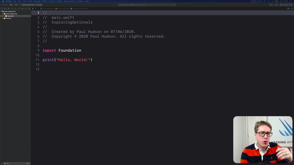
FREE: Making the most of optionals
Swift’s optionals are implemented as simple enums, with just a little compiler magic sprinkled around as syntactic sugar. However, they do much more than people realize, and in this article I’m going to demonstrate some of their power features that can really help you write better code – and blow your mind along the way.
11:03
ULTIMATE PORTFOLIO APP
FREE: Ultimate Portfolio App: Introduction
UPDATED: While I’m sure you’re keen to get started programming immediately, please give me a few minutes to outline the goals of this course and explain why it’s different from other courses I’ve written.
4:41
SOLUTIONS
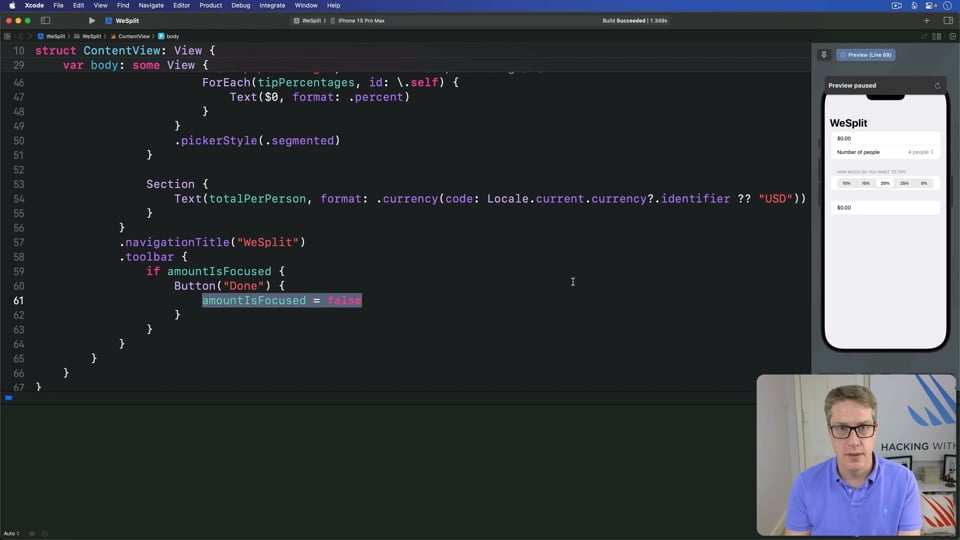
WeSplit
There are three challenges for WeSplit, including adding section headers and showing a grand total. Let’s solve them now…
42:07
INTERMEDIATE SWIFTUI
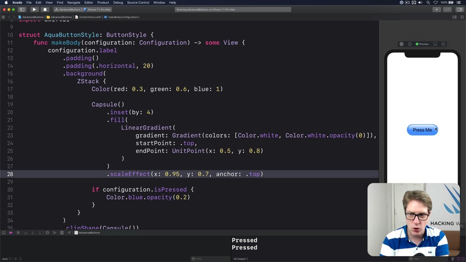
Advanced button customization using ButtonStyle
Previously we looked at how to create basic button styles that unify your app’s styling efficiently. In this follow-on article we’re going to explore three completely different button styles that show off just what SwiftUI is capable of: glossy marble buttons, classic fantasy buttons, and sci-fi buttons.
1:49:57
EVENTS
Upgrading your SwiftUI
In this article we’re going to build part of a SwiftUI app that helps users find designers for work. The goal here isn’t to build a full app, but instead to explore lesser-known SwiftUI features in a practical way.
1:50:22
LIVE STREAMS
Flashlight
In this stream we're going to build a trivial game with SwiftUI, but then look at ways we can make it more interesting through difficulty variations – there's so much room to experiment!
25:14
SOLUTIONS
Habit tracking
This challenge asks you to create a habit-tracking app, optionally with Codable support and completion count. Let’s tackle it now…
53:37
REMAKING APPS
Creating a day/night cycle
One of the most beautiful parts of the Weather app is the way it smoothly transitions between day and night – it doesn’t just go from black to blue, but instead mimics both sunrise and sunset, smoothly animating between the two. In this tutorial we’re going to recreate that same effect in our own app.
