The Complete Guide to SF Symbols
Example code, tips, and techniques for both SwiftUI and UIKit
SF Symbols allows us to render a huge and growing variety of icons inside our apps, and every year it gets bigger – not only do many more icons get added, but iOS 14 added the ability to render multicolor icons and iOS 15 added the ability to have complete control over individual layers.
In this article I’m going to walk you how to use SF Symbols in your projects, providing code for both SwiftUI and UIKit. Let’s get into it…
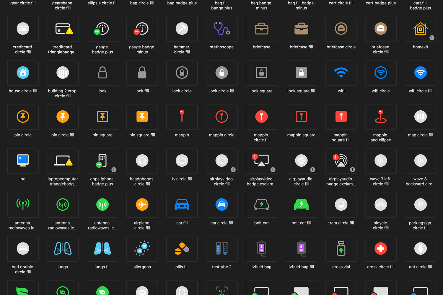
Tip: The best way to browse the list of symbols is using Apple’s free SF Symbols app.

SPONSORED Join a FREE crash course for mid/senior iOS devs who want to achieve an expert level of technical and practical skills – it’s the fast track to being a complete senior developer! Hurry up because it'll be available only until April 28th.
Sponsor Hacking with Swift and reach the world's largest Swift community!
How to load an SF Symbol
The simplest thing you’re going to want to do is load a symbol. We’ll be using “star” here, but if you’re using the SF Symbols app you can right-click any symbol and choose Copy Name.
In SwiftUI loading an image is done by placing an Image into your view hierarchy using its systemName initializer:
Image(systemName: "star")In UIKit you need to use UIImage then place it in a UIImageView, like this:
let image = UIImage(systemName: "star")
let imageView = UIImageView(image: image)
How to place SF Symbols next to text
SF Symbols work great when used inside text, particularly when they contain common symbols such as error crosses, check marks, calendars, and similar.
In SwiftUI placing an image next to text is done like this:
Label("Please try again", systemImage: "xmark.circle")If you want to place it inside the text string, it’s better to use string interpolation with Image, like this:
Text("Please press the \(Image(systemName: "calendar")) button")For UIKit the code is a little more complex because you need to use NSAttributedString and NSTextAttachment to render something into a UILabel, but the same code lets you place the images wherever you want them:
let attachment = NSTextAttachment()
attachment.image = UIImage(systemName: "xmark.circle")

let imageString = NSMutableAttributedString(attachment: attachment)
let textString = NSAttributedString(string: "Please try again")
imageString.append(textString)

let label = UILabel()
label.attributedText = imageString
label.sizeToFit()
How to change the size of an SF Symbol
SF Symbols are entirely vector graphics, so you can adjust their size freely without losing quality. This also works for the built-in Dynamic Type sizes, where SF Symbols will adapt themselves to match other text in your UI.
In SwiftUI, adjusting the size an SF Symbol is done using the font() modifier with a built-in text style, like this:
Image(systemName: "airplane")
    .font(.largeTitle)
Or using a custom font size like this:
Image(systemName: "house")
    .font(.system(size: 72))
In UIKit, adjusting the size of a symbol is done using UIImage.SymbolConfiguration, like this:
let config = UIImage.SymbolConfiguration(textStyle: .largeTitle)
let image = UIImage(systemName: "airplane", withConfiguration: config)
Or using a custom font size like this:
let config = UIImage.SymbolConfiguration(pointSize: 72)
let image = UIImage(systemName: "airplane", withConfiguration: config)
How to adjust the scale of an SF Symbol
You’ve just seen how SF Symbols can have custom font sizes attached, allowing them to flow inside your text neatly. However, we can also scale SF Symbols to be slightly smaller or slightly larger, independent on their font size, which allows you even more fine-grained control over how they look in your UI.
In SwiftUI, you adjust the scale of an SF Symbol like this:
Image(systemName: "house")
    .imageScale(.large)
As I said, this happens in combination with any custom font, so you can use both if you want:
Image(systemName: "house")
    .font(.largeTitle)
    .imageScale(.large)
In UIKit this is done with another symbol configuration, this time using its scale initializer:
let config = UIImage.SymbolConfiguration(scale: .large)
let image = UIImage(systemName: "house", withConfiguration: config)
And again you can provide both a custom font and a scale:
let config = UIImage.SymbolConfiguration(textStyle: .largeTitle, scale: .large)
let image = UIImage(systemName: "house", withConfiguration: config)
How to make SF Symbols bold by adjusting their weight
All SF Symbols are available in all font weights, from ultra light to black, which means you can make them stand out or otherwise with very little work.
In SwiftUI you adjust the weight of an SF Symbol like this:
Image(systemName: "keyboard")
    .font(.largeTitle.weight(.black))
In UIKit, adjust the weight is done by creating two instances of UIImage.SymbolConfiguration then combining them together:
let largeTitle = UIImage.SymbolConfiguration(textStyle: .largeTitle)
let black = UIImage.SymbolConfiguration(weight: .black)
let combined = largeTitle.applying(black)
let image = UIImage(systemName: "keyboard", withConfiguration: combined)
How to change the color of an SF Symbol
SF Symbols render in a default color depending on which layout system you’re using – SwiftUI uses the default font color, whereas UIKit uses the default tint color. Either way, you can customize the icon’s color in a variety of ways.
To complete recolor an SF Symbol using SwiftUI – i.e., to change all parts of it to one color – use the foregroundColor() modifier like this:
Image(systemName: "doc")
    .foregroundColor(.red)
In UIKit you have two options: either change the tint color of the image view you’re placing the symbol in:
let image = UIImage(systemName: "doc")
let imageView = UIImageView(image: image)
imageView.tintColor = .systemRed
Alternatively, adjust the UIImage itself so that it’s recolored everywhere:
let image = UIImage(systemName: "doc")?.withTintColor(.systemRed, renderingMode: .alwaysOriginal)
let imageView = UIImageView(image: image)
How to render hierarchical SF Symbols
In iOS 15 and later many SF Symbols icons contain several layers that represent depth in the icon, and these can be rendered with a little transparency to help make the icon’s meaning stand out. This works even when recolor the image – you’ll just varying shades of your color thanks to the transparency.
In SwiftUI you can render a hierarchical SF Symbol like this:
Image(systemName: "square.stack.3d.down.right.fill")
    .symbolRenderingMode(.hierarchical)
    .foregroundColor(.indigo)
In UIKit, this is done by specifying a hierarchical color as part of your configuration, like this:
let config = UIImage.SymbolConfiguration(hierarchicalColor: .systemIndigo)
let image = UIImage(systemName: "square.stack.3d.down.right.fill", withConfiguration: config)
How to render multicolor SF Symbols
In iOS 14 and later many SF Symbols have built-in colors that carry specific meaning, such as “externaldrive.badge.plus” – by external drive uses the default color, but the plus badge is green. This multicolor drawing mode isn’t enabled by default, so your symbols will render in the colors discussed above, but you can enable the default multicolor mode if you want.
In SwiftUI, you enable multicolor SF Symbols like this for iOS 15 or later:
Image(systemName: "externaldrive.badge.plus")
    .symbolRenderingMode(.multicolor)
Or with this for iOS 14:
Image(systemName: "externaldrive.badge.plus")
    .renderingMode(.original)
In UIKit this is done using configurationPreferringMulticolor(), like this:
let config =  UIImage.SymbolConfiguration.configurationPreferringMulticolor()
let image = UIImage(systemName: "externaldrive.badge.plus", withConfiguration: config)
Tip: Images that don’t have a multicolor variant will automatically be rendered monochrome, as if you hadn’t changed the setting.
How to create a custom SF Symbols palette
In iOS 15 and later many SF Symbols are divided into segments that support two or even three colors. How they are rendered depends on how many segments they contain and how many colors you provide:
- If they have 1 segment, it will always use the first color you specify; further colors are ignored.
- If they have 2 segments and you specify 1 color, that will be used for both segments. If you specify 2 colors, one will be used for each segment. If you specify 3 colors, the third one is ignored.
- If they have 3 segments and you specify 1 color, that will be used for all three segments. If you specify 2 colors, one will be used for the first segment, and the other color for the remaining two segments. If you specify 3 colors, one will be used for each segment.
In SwiftUI you can render a palette image by using the .palette rendering mode followed by a foreground style containing one, two, or three colors:
Image(systemName: "person.3.sequence.fill")
    .symbolRenderingMode(.palette)
    .foregroundStyle(.red, .green, .blue)
You can actually use any kind of ShapeStyle instead of just colors, meaning that you could use three different materials:
Image(systemName: "person.3.sequence.fill")
    .symbolRenderingMode(.palette)
    .foregroundStyle(
        .ultraThickMaterial,
        .regularMaterial,
        .ultraThinMaterial
    )
Or even three linear gradients:
Image(systemName: "person.3.sequence.fill")
    .symbolRenderingMode(.palette)
    .foregroundStyle(
        .linearGradient(colors: [.red, .black], startPoint: .top, endPoint: .bottomTrailing),
        .linearGradient(colors: [.green, .black], startPoint: .top, endPoint: .bottomTrailing),
        .linearGradient(colors: [.blue, .black], startPoint: .top, endPoint: .bottomTrailing)
    )
    .font(.largeTitle)
In UIKit this is done using another symbol configuration, this time passing in an array of colors to the paletteColors initializer:
let config = UIImage.SymbolConfiguration(paletteColors: [.systemRed, .systemGreen, .systemBlue])
let image = UIImage(systemName: "person.3.sequence.fill", withConfiguration: config)
UIKit is not able to use materials or gradients in its palette, only colors.
How to adjust SF Symbol variants
In iOS 15 and later some SF Symbols are provided with a variety of variants, namely one or more of circle, fill, rectangle, slash, or square. In UIKit you need to activate these by name – e.g. “bell.slash” – but in SwiftUI there’s a symbolVariant() modifier that makes this easier.
For example, this renders a bell icon with a slash through it:
Image(systemName: "bell")
    .symbolVariant(.slash)
And this surrounds the bell with a square:
Image(systemName: "bell")
    .symbolVariant(.square)
These can be combined if you need them, like this:
Image(systemName: "bell")
    .symbolVariant(.fill.slash)
There is also a .none option that renders the original image, which is helpful if you need to move between two states of the icon. For example, this flips a toggle between two states
struct ContentView: View {
    @State private var showingAlerts = true

    var body: some View {
        Toggle(isOn: $showingAlerts) {
            Label("Show Alerts", systemImage: "bell")
                .symbolVariant(showingAlerts ? .none : .slash)
        }
        .toggleStyle(.button)
    }
}
How to describe SF Symbols for VoiceOver
Many SF Symbols have useful VoiceOver labels by default, such as “heart” being read out as “love” and “calendar.badge.plus” being read as “add to calendar.” However, many other icons don’t have such built-in names, including complex icons such as “arrowshape.turn.up.backward.circle”. In these circumstances you should set a custom accessibility label describing the content for VoiceOver.
In SwiftUI, you attach a custom accessibility label to an SF Symbol like this:
Image(systemName: "arrowshape.turn.up.backward.circle")
    .accessibilityLabel("Go back")
If you’re using a label, VoiceOver will use your label’s text even if it isn’t currently being displayed.
Tip: You can also place your accessibility label into your Localizable.strings file using the same name as the SF Symbol, and SwiftUI will use that instead.
In UIKit the accessibility label is set on the control that presents the symbol, like this:
let image = UIImage(systemName: "arrowshape.turn.up.backward.circle")
let imageView = UIImageView(image: image)
imageView.accessibilityLabel = "Go back"
How to make SF Symbols adapt to their context
In iOS 15 and later many SF Symbols automatically adapt to how they are used, including the way the “signature” symbol changes to match various localizations such as Japanese or Hebrew.
However, SwiftUI has one power feature that UIKit lacks, which is the ability to render SF Symbols according to their context. This is most important inside TabView, where the correct variant of a symbol is system-dependent: on iOS Apple’s human interface guidelines recommend filled icons, whereas on macOS they recommend using strokes instead.
SwiftUI does something clever here: if you use an SF Symbol for a tab item, you shouldn’t specify whether it’s filled or not – it will automatically adapt based on the system.
So, this will create a tab item using a filled person symbol on iOS, but a stroked person on macOS:
TabView {
    Text("Your View Here")
        .tabItem {
            Label("Home", systemImage: "person")
                .symbolVariant(.none)
        }
}
What next?
SF Symbols started big and has somehow grown even more every year – not only are we getting increasing numbers of symbols, but they are getting more impressive and more context aware too.
The fact that SF Symbols is already the standard way to use iconography in your apps shows just how powerful, flexible, and useful it is, and hopefully you’ll find they fit right into your own projects!
SPONSORED Join a FREE crash course for mid/senior iOS devs who want to achieve an expert level of technical and practical skills – it’s the fast track to being a complete senior developer! Hurry up because it'll be available only until April 28th.
Sponsor Hacking with Swift and reach the world's largest Swift community!


