How to build neumorphic designs with SwiftUI
Try out a new design trend and learn something new
Neumorphic design is easily the most interesting design trend of recent months, although to be fair Apple did use it as their design motif way back in WWDC18. In this article we’re going to look at how you can build neumorphic designs using SwiftUI, why you might want to, and – most importantly – how we can modify those designs to be more accessible.
Important: Neumorphism – sometimes called neomorphism – has serious implications for accessibility, so although it’s tempting to read the first part of this article then skip the rest, I encourage you to stick around and learn the downsides as well as the upsides so you get the full picture.

SPONSORED Join a FREE crash course for mid/senior iOS devs who want to achieve an expert level of technical and practical skills – it’s the fast track to being a complete senior developer! Hurry up because it'll be available only until April 28th.
Sponsor Hacking with Swift and reach the world's largest Swift community!
The basics of neumorphism
Before we get into the code, I just want to briefly touch on the two core principles of this design trend, because it will be relevant as we progress:
- It uses highlights and shadows to define the shapes of objects on the screen.
- Contrast is generally reduced; full white or black aren’t used, which is what allows the highlights and shadows to stand out.
The end result is an “extruded plastic” look – a user interface design that certainly looks fresh and interesting without being harsh on your eyes. I can’t repeat enough that reducing contrast and relying on shadows for shapes has serious impacts on accessibility, and we’ll be coming back to this later.
However, I still think it’s worth taking the time to explore neumorphism in SwiftUI – even if you don’t use it in your own apps, it’s a bit like a coding kata that will help hone your skills.
OK, enough waffle – let’s look at some code.
Building a neumorphic card
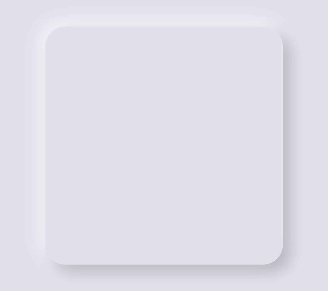
The simplest starting point is to build a neumorphic card: a rounded rectangle that will contain some information. From there we’ll look at how we can move it over to other parts of SwiftUI, but the principles remain the same.
Start by creating a new iOS project using the Single View App template. Make sure and use SwiftUI for the user interface, then name it Neumorphism.
Tip: If you have access to Xcode’s SwiftUI preview, I recommend you activate it now – you’ll find it much easier for experimentation.
We’re going to start by defining a color to represent an off white shade. This isn’t gray, but a very subtle tint that adds a little warmth or coolness to the UI. You can add this in an asset catalog if you want, but here it’s easier in code.
Add this Color extension outside of the ContentView struct:
extension Color {
    static let offWhite = Color(red: 225 / 255, green: 225 / 255, blue: 235 / 255)
}
Yes, that’s very nearly white, but it’s dark enough that actual white will stand out like a glow when we need it.
Now we can fill in the body for ContentView, giving it a ZStack that takes up the full screen, and using our new off white color to fill the whole space:
struct ContentView: View {
var body: some View {
ZStack {
Color.offWhite
}
.edgesIgnoringSafeArea(.all)
}
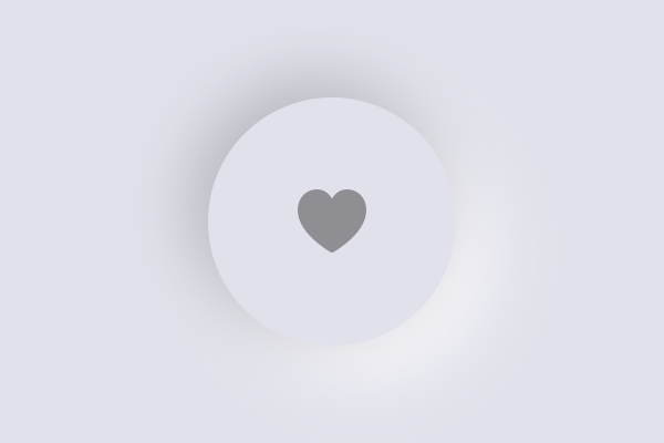
}We’re going to use a rounded rectangle to represent our card, and we’ll fix it at 300x300 to make it a nice and clear on the screen. So, add this to the ZStack, below the color:
RoundedRectangle(cornerRadius: 25)
    .frame(width: 300, height: 300)
That will have a default color of black, but in neumorphism we want to dramatically reduce contrast, so we replace that with the same color we use for our background – effectively making the shape invisible.
So, change it to this:
RoundedRectangle(cornerRadius: 25)
    .fill(Color.offWhite)
    .frame(width: 300, height: 300)
Now for the important part: we define the shape using shadows, one dark and one light, as if there were a light casting rays from the top-left corner of the screen.
SwiftUI lets us apply modifiers multiple times, which makes neumorphism easy to achieve. Add these two modifiers to your rounded rectangle to see it in action:
.shadow(color: Color.black.opacity(0.2), radius: 10, x: 10, y: 10)
.shadow(color: Color.white.opacity(0.7), radius: 10, x: -5, y: -5)
That’s a dark shadow offset in the bottom right, and a light shadow offset in the top left. The light shadow is visible because we used off-white for our background, and together the card becomes visible.
We’ve only written a handful of lines of code, but already we have a neumorphic card – I hope you’ll agree SwiftUI makes it surprisingly easy!
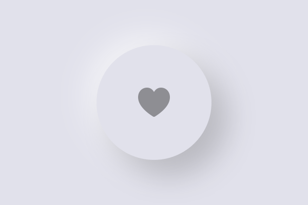
Building a simple neumorphic button
As UI elements go, cards are fairly low risk for neumorphism – as long as the UI inside your cards is clear, the card border itself could easily not exist and you wouldn’t affect accessibility. Buttons are a different matter because they exist to be tapped, so reducing their contrast can do more harm than good.
Let’s explore this by creating a custom button style, which is how SwiftUI lets us share button configurations in many places. This is much more convenient than attaching lots of modifiers to every button we create – we can just define the style once, and share it in many places.
We’re going to define a button style that is effectively empty: SwiftUI will hand us the label for the button, which might be some text, an image, or something else, and we’ll send it back unmodified.
Add this struct somewhere outside of ContentView:
struct SimpleButtonStyle: ButtonStyle {
    func makeBody(configuration: Self.Configuration) -> some View {
        configuration.label
    }
}
That configuration.label is what holds the contents of the button, and we’ll be adding more to it shortly. First, though, let’s define a button that uses it, so you can see the design evolve:
Button(action: {
print("Button tapped")
}) {
Image(systemName: "heart.fill")
.foregroundColor(.gray)
}
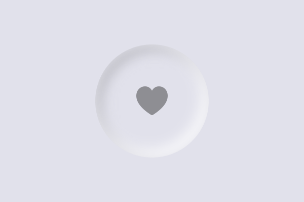
.buttonStyle(SimpleButtonStyle())You won’t see anything special on the screen but we can fix that by adding our neumorphic effect to the button style. This time we’re not going to use a rounded rectangle because for simple icons a circle looks better, but we do need to add some padding so that the tap area of the button is nice and big.
Modify your makeBody() method so that we add some padding, then place our neumorphic effect as a background to the button:
configuration.label
    .padding(30)
    .background(
        Circle()
            .fill(Color.offWhite)
            .shadow(color: Color.black.opacity(0.2), radius: 10, x: 10, y: 10)
            .shadow(color: Color.white.opacity(0.7), radius: 10, x: -5, y: -5)
    )
That takes us a lot of the way towards the effect we want, but if you run the app back you’ll see it doesn’t behave well in practice – the button doesn’t respond visually when pressed, which is just odd.
To fix this, we need to read the configuration.isPressed property inside our custom button style, which reports whether the button is currently being held down or not. We can use that to adjust our styling to give some visual indication of whether the button is pressed.
Let’s start simple: we’ll use a Group for the button’s background, then check configuration.isPressed and return either a flat circle if the button is pressed, or return our current shadowed circle otherwise:
configuration.label
    .padding(30)
    .background(
        Group {
            if configuration.isPressed {
                Circle()
                    .fill(Color.offWhite)
            } else {
                Circle()
                    .fill(Color.offWhite)
                    .shadow(color: Color.black.opacity(0.2), radius: 10, x: 10, y: 10)
                    .shadow(color: Color.white.opacity(0.7), radius: 10, x: -5, y: -5)
            }
        }
    )
Because the isPressed state uses a circle with the off white color, it makes our effect invisible when the button is being held down.
Warning: Because of the way SwiftUI calculates tappable areas, we just accidentally made the tappable area for our button really small – you need to tap on the image itself, not the neumorphic design around it. To fix that, add the .contentShape(Circle()) modifier directly after .padding(30), forcing SwiftUI to use all available space for the tap.
Now, we could create a fake depressed effect by flipping the shadows – by copying the two shadow modifiers from the regular effect, then exchanging the white and black X and Y values, like this:
if configuration.isPressed {
    Circle()
        .fill(Color.offWhite)
        .shadow(color: Color.black.opacity(0.2), radius: 10, x: -5, y: -5)
        .shadow(color: Color.white.opacity(0.7), radius: 10, x: 10, y: 10)
} else {
    Circle()
        .fill(Color.offWhite)
        .shadow(color: Color.black.opacity(0.2), radius: 10, x: 10, y: 10)
        .shadow(color: Color.white.opacity(0.7), radius: 10, x: -5, y: -5)
}
Try that out and see what you think!
Creating inner shadows for a button press
Our current code kind of works, but people interpret the effect differently – some see it as a concave button, others see it as the button still being raised but the light coming from a different angle.
A better idea is to create an inner shadow that looks much more like the button is being pressed inwards. This doesn’t come with SwiftUI as standard, but we can make one easily enough.
Creating an inner shadow requires two linear gradients, and these will be the first of many inner gradients we’ll be using in this article, so we’ll add a small helper extension to LinearGradient to make creating standard gradients easier:
extension LinearGradient {
    init(_ colors: Color...) {
        self.init(gradient: Gradient(colors: colors), startPoint: .topLeading, endPoint: .bottomTrailing)
    }
}
With that in place we can just provide a variadic list of colors to get back a linear gradient of them in a diagonal direction.
Now for the important part: rather than adding two flipped shadows to our pressed circle, we’re going to overlay a new circle on top of it, give it a blurred stroke, then mask it with another circle that has a gradient. That’s a lot, but let me break it down:
- Our base circle is the neumorphic effect circle we have right now, which is filled with our off white color.
- We place a circle over that, stroked with a gray border and blurred a little to make it a soft edge.
- We then mask that overlaid circle with another circle, this time filled with a linear gradient.
When you mask one view with another, SwiftUI uses the alpha channel of the mask to determine what should be shown of the underlying view. So, if we draw a blurry gray stroke then mask it using a linear gradient of black to clear, the blurry stroke will be invisible on one side and fade in on the other – we get a smooth inner gradient. To make the effect more pronounced, we can offset the stroked circles a little in either direction, and with a little experimentation I found that drawing the light shadow in a thicker line than the dark shadow really helped maximize the effect.
Remember, neumorphism uses two shadows, one light and one dark, to create a sense of depth, so we’ll add this inner shadow effect twice with different colors.
Modify the configuration.isPressed circle to this:
Circle()
    .fill(Color.offWhite)
    .overlay(
        Circle()
            .stroke(Color.gray, lineWidth: 4)
            .blur(radius: 4)
            .offset(x: 2, y: 2)
            .mask(Circle().fill(LinearGradient(Color.black, Color.clear)))
    )
    .overlay(
        Circle()
            .stroke(Color.white, lineWidth: 8)
            .blur(radius: 4)
            .offset(x: -2, y: -2)
            .mask(Circle().fill(LinearGradient(Color.clear, Color.black)))
    )
If you run the app again you’ll see the button press effect is much more pronounced, and it looks better too.
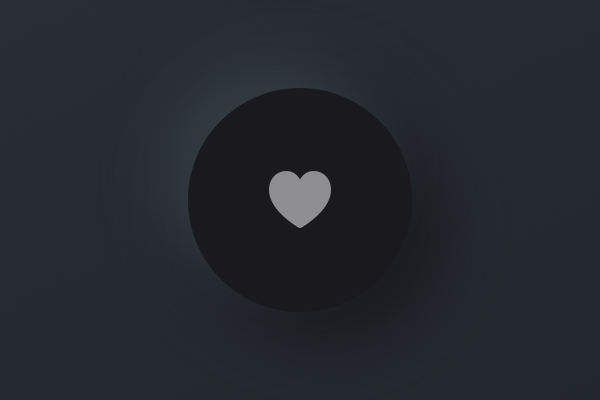
Going dark
Before we start looking at how we can improve the accessibility problems of neumorphism, let’s take a look at how we can play with the effect to create other interesting styles.
First, add two more colors to the Color extension, so we have some constant values to work with:
static let darkStart = Color(red: 50 / 255, green: 60 / 255, blue: 65 / 255)
static let darkEnd = Color(red: 25 / 255, green: 25 / 255, blue: 30 / 255)
We can now use that as the background for ContentView by replacing its existing Color.white, like this:
var body: some View {
    ZStack {
        LinearGradient(Color.darkStart, Color.darkEnd)
Our SimpleButtonStyle looks out of place now, because it applies bright styling on a dark background. So, we’re going to create a new dark style that works better, but this time we’re going to split it in two: a background view we can apply anywhere, and a button style that wraps it alongside the padding and content shape modifiers. This will allow us more flexibility, as you’ll see.
The new background view we’re going to add will allow us to specify any shape for our visual effect, so we aren’t just tied to circles any more. It will also track whether to draw a concave our convex effect (in or out) depending on an isHighlighted property that we can send in externally.
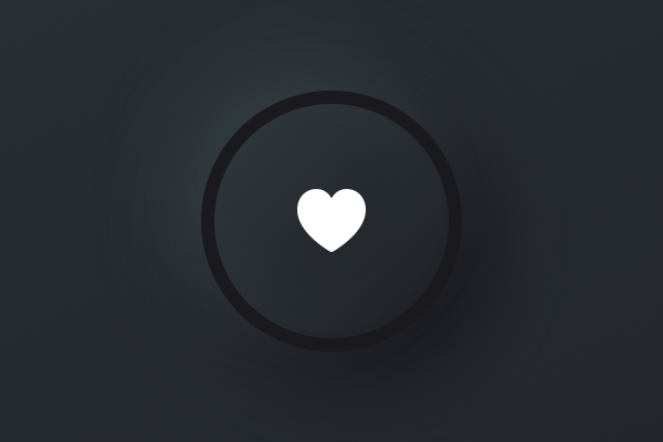
We’re going to start off really simple, using a modified shadow flip approach to getting a press effect. Add this struct now:
struct DarkBackground<S: Shape>: View {
    var isHighlighted: Bool
    var shape: S

    var body: some View {
        ZStack {
            if isHighlighted {
                shape
                    .fill(Color.darkEnd)
                    .shadow(color: Color.darkStart, radius: 10, x: 5, y: 5)
                    .shadow(color: Color.darkEnd, radius: 10, x: -5, y: -5)

            } else {
                shape
                    .fill(Color.darkEnd)
                    .shadow(color: Color.darkStart, radius: 10, x: -10, y: -10)
                    .shadow(color: Color.darkEnd, radius: 10, x: 10, y: 10)
            }
        }
    }
}
The modification there is that the shadow size is reduced when the button is depressed – we use a distance of 5 points rather than 10.
We can then wrap that inside a DarkButtonStyle, which applies padding and a content shape, like this:
struct DarkButtonStyle: ButtonStyle {
    func makeBody(configuration: Self.Configuration) -> some View {
        configuration.label
            .padding(30)
            .contentShape(Circle())
            .background(
                DarkBackground(isHighlighted: configuration.isPressed, shape: Circle())
            )
    }
}
Finally, we can activate that for our button in ContentView by changing its buttonStyle() modifier:
.buttonStyle(DarkButtonStyle())Try it out and see what you think – even though we don’t have a lot of code, I think the result looks pretty good.
A little experimentation
Now is a great time to experiment with the effect, because it will help you understand exactly what SwiftUI is doing for us.
For example, we could create a smooth bump-like button by adding a linear gradient to the button, and flipping it when pressed:
if isHighlighted {
    shape
        .fill(LinearGradient(Color.darkEnd, Color.darkStart))
        .shadow(color: Color.darkStart, radius: 10, x: 5, y: 5)
        .shadow(color: Color.darkEnd, radius: 10, x: -5, y: -5)

} else {
    shape
        .fill(LinearGradient(Color.darkStart, Color.darkEnd))
        .shadow(color: Color.darkStart, radius: 10, x: -10, y: -10)
        .shadow(color: Color.darkEnd, radius: 10, x: 10, y: 10)
}
If you try that you’ll see the button smoothly animates up and down as you press and release it. I find the animation a little distracting, so I recommend you disable it by adding this modifier in the makeBody() method of DarkButtonStyle, after the existing background() modifier:
.animation(nil)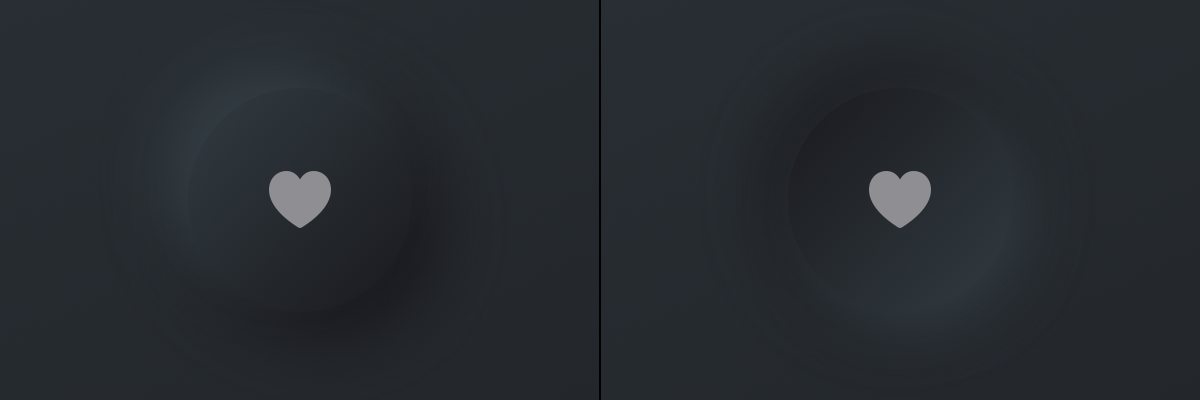
This “pillow” button effect is fascinating, but if you’re considering using it I would suggest you try out three changes to help the buttons stand out a little more.
First, even though it goes against the low-contrast principle of neumorphic design, I would ditch the gray icon and go with white instead, so that it really stands out. So, in ContentView you’d use this:
Image(systemName: "heart.fill")
    .foregroundColor(.white)
Second, if you add an overlay in the pressed state for the button, not only does it look more like a physical button being pressed flat but it also helps distinguish its pressed state from its unpressed state.
To make that happen, you need to insert an overlay() modifier after the fill() when isHighlighted is true, like this:
if isHighlighted {
    shape
        .fill(LinearGradient(Color.darkEnd, Color.darkStart))
        .overlay(shape.stroke(LinearGradient(Color.darkStart, Color.darkEnd), lineWidth: 4))
        .shadow(color: Color.darkStart, radius: 10, x: 5, y: 5)
        .shadow(color: Color.darkEnd, radius: 10, x: -5, y: -5)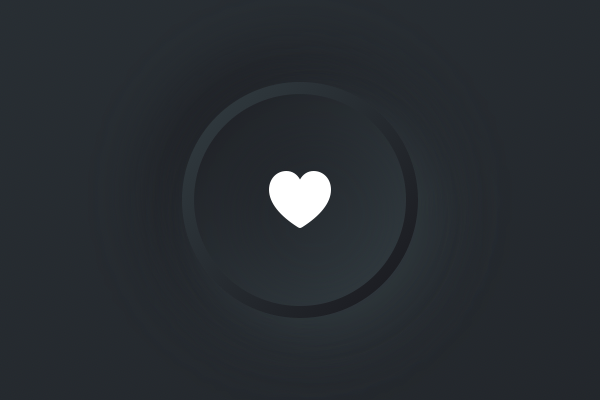
For an even sharper look, you could remove the two shadow() modifiers for the pressed state, which really focuses the overlay instead.
Third, you could also add an overlay to the unpressed state, just to help mark that it’s a button. Put it directly after the fill() there too, like this:
} else {
    shape
        .fill(LinearGradient(Color.darkStart, Color.darkEnd))
        .overlay(shape.stroke(Color.darkEnd, lineWidth: 4))
        .shadow(color: Color.darkStart, radius: 10, x: -10, y: -10)
        .shadow(color: Color.darkEnd, radius: 10, x: 10, y: 10)
}
Adding a toggle style
One of the benefits of splitting our button style from the neumorphic background style is that we can now add a toggle style using the same effect. This means creating a new struct that conforms to the ToggleStyle protocol, which is similar to ButtonStyle except:
- We should read
configuration.isOnto determine whether the toggle is enabled or not. - We need to provide a button to handle the actual toggle action itself, or at least some sort of
onTapGesture()or similar.
Add this struct to your project now:
struct DarkToggleStyle: ToggleStyle {
    func makeBody(configuration: Self.Configuration) -> some View {
        Button(action: {
            configuration.isOn.toggle()
        }) {
            configuration.label
                .padding(30)
                .contentShape(Circle())
        }
        .background(
            DarkBackground(isHighlighted: configuration.isOn, shape: Circle())
        )
    }
}
We want to put one of those in ContentView so you can try it for yourself, so start by adding this property there:
@State private var isToggled = falseNext, wrap the existing button in a VStack with a spacing of 40, and place this below:
Toggle(isOn: $isToggled) {
    Image(systemName: "heart.fill")
        .foregroundColor(.white)
}
.toggleStyle(DarkToggleStyle())
Your ContentView struct should look like this:
struct ContentView: View {
    @State private var isToggled = false

    var body: some View {
        ZStack {
            LinearGradient(Color.darkStart, Color.darkEnd)

            VStack(spacing: 40) {
                Button(action: {
                    print("Button tapped")
                }) {
                    Image(systemName: "heart.fill")
                        .foregroundColor(.white)
                }
                .buttonStyle(DarkButtonStyle())

                Toggle(isOn: $isToggled) {
                    Image(systemName: "heart.fill")
                        .foregroundColor(.white)
                }
                .toggleStyle(DarkToggleStyle())
            }
        }
        .edgesIgnoringSafeArea(.all)
    }
}
And that’s it – we’ve shared our common neumorphic design in two places!
Fixing up the accessibility
We’ve had ample time to play around with the various neumorphic styles, but now I want to address its problems head on: the extreme lack of contrast means that buttons and other important controls don’t stand out sufficiently from the things around them, which makes it harder for folks with vision impairments to use our apps.
This is a point where I’ve seen some confusion circling, so I want to say a few things up front:
- Yes, I realize that Apple’s default buttons just look like blue text and so don’t “look” like buttons at least at first, but they do have a high contrast ratio.
- It’s not enough to say “it works for me, but I can add a special option to make it more accessible” – accessibility isn’t a “nice thing to have”, it’s a requirement, so our apps should be accessible by default rather than “opt-in accessible”.
- The controls we made are still SwiftUI buttons and toggles, which means all our changes haven’t affected their visibility or functionality for VoiceOver or Apple’s other assistive technologies.
You already saw how we could switch out gray icons for white to get an immediate boost in contrast, but buttons and toggles still need a lot more contrast if they want to be accessible.
So, we’re going to explore what changes we could make to help things really stand out.
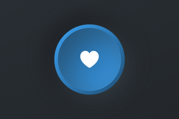
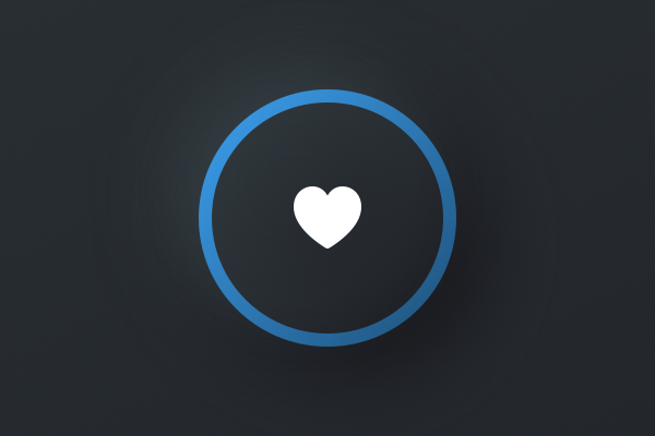
First, I’d like you to add two new colors to our extension:
static let lightStart = Color(red: 60 / 255, green: 160 / 255, blue: 240 / 255)
static let lightEnd = Color(red: 30 / 255, green: 80 / 255, blue: 120 / 255)
Second, duplicate your existing DarkBackground and call the copy ColorfulBackground. We’ll edit this in a moment, but again we need to get the rest of the set up done first.
Third, duplicate the dark button style and toggle style, rename them to ColorfulButtonStyle and ColorfulToggleStyle, then make them use the new ColorfulBackground for their background.
So, they should look like this:
struct ColorfulButtonStyle: ButtonStyle {
    func makeBody(configuration: Self.Configuration) -> some View {
        configuration.label
            .padding(30)
            .contentShape(Circle())
            .background(
                ColorfulBackground(isHighlighted: configuration.isPressed, shape: Circle())
            )
            .animation(nil)
    }
}

struct ColorfulToggleStyle: ToggleStyle {
    func makeBody(configuration: Self.Configuration) -> some View {
        Button(action: {
            configuration.isOn.toggle()
        }) {
            configuration.label
                .padding(30)
                .contentShape(Circle())
        }
        .background(
            ColorfulBackground(isHighlighted: configuration.isOn, shape: Circle())
        )
    }
}
And finally, edit the button and toggle in ContentView to use the new button style:
Button(action: {
    print("Button tapped")
}) {
    Image(systemName: "heart.fill")
        .foregroundColor(.white)
}
.buttonStyle(ColorfulButtonStyle())

Toggle(isOn: $isToggled) {
    Image(systemName: "heart.fill")
        .foregroundColor(.white)
}
.toggleStyle(ColorfulToggleStyle())
You can run the app if you want to, but there isn’t much point – it hasn’t actually changed.
To bring our colorful version to life, we’re going to change the fill() and overlay() modifiers for the pressed and unpressed states. So, when isHighlighted is true, change darkStart and darkEnd to lightStart and lightEnd, like this:
if isHighlighted {
    shape
        .fill(LinearGradient(Color.lightEnd, Color.lightStart))
        .overlay(shape.stroke(LinearGradient(Color.lightStart, Color.lightEnd), lineWidth: 4))
        .shadow(color: Color.darkStart, radius: 10, x: 5, y: 5)
        .shadow(color: Color.darkEnd, radius: 10, x: -5, y: -5)
If you run the app again you’ll see it’s already a big improvement: the pressed state now has a strong blue color, so it’s clear when buttons are down or when toggles are active. But we can still do better – we can add the same color around the button when it isn’t pressed, helping draw attention to it.
To do that, change the existing overlay() for the unpressed state to this:
.overlay(shape.stroke(LinearGradient(Color.lightStart, Color.lightEnd), lineWidth: 4))So, the finished button style should look like this:
ZStack {
    if isHighlighted {
        shape
            .fill(LinearGradient(Color.lightEnd, Color.lightStart))
            .overlay(shape.stroke(LinearGradient(Color.lightStart, Color.lightEnd), lineWidth: 4))
            .shadow(color: Color.darkStart, radius: 10, x: 5, y: 5)
            .shadow(color: Color.darkEnd, radius: 10, x: -5, y: -5)
    } else {
        shape
            .fill(LinearGradient(Color.darkStart, Color.darkEnd))
            .overlay(shape.stroke(LinearGradient(Color.lightStart, Color.lightEnd), lineWidth: 4))
            .shadow(color: Color.darkStart, radius: 10, x: -10, y: -10)
            .shadow(color: Color.darkEnd, radius: 10, x: 10, y: 10)
    }
}
Now run the app again and you’ll see there’s a blue ring around buttons and toggles, and it fills in blue when pressed – it’s a lot clearer.
Wrap up
In practice you’re not going to have multiple different button styles all in the same project, or at least not if you don’t like creating a headache for your users. But it is fun to experiment, and I hope that’s come across in this article because you can create some really beautiful effects without a great deal of work.
I have repeatedly said that you should always keep an eye on your accessibility, and that means more than just making sure VoiceOver works with your UI. Make sure your buttons look interactive, make sure your text labels and icons have sufficient contrast ratio to their backgrounds (at least 4.5:1, but aim for 7:1), and make sure your tap areas are nice and large (at least 44x44 points).
So, by all means use neumorphic design to experiment, and use it to help increase your knowledge of SwiftUI, but never forget that if you sacrifice usability for a fancy new design trend no one wins.
Get the completed source code for this project: Download from GitHub
SPONSORED Join a FREE crash course for mid/senior iOS devs who want to achieve an expert level of technical and practical skills – it’s the fast track to being a complete senior developer! Hurry up because it'll be available only until April 28th.
Sponsor Hacking with Swift and reach the world's largest Swift community!


